- Travel
-
Exhibits
- Gatos Cubanos/ Cuban Cats
- Mujeres, Cuban Women Making Cuban Art
- José Fuster
- La Portada Cubana
- Immortal Cuba: Artists Take on Their Heroes
- Seattle Poster Exhibit
- Sandra Dooley & Alejandrina Cué
- The Art of Wayacón
- Cuban Folk Art
- Cuba In Black And White
- 25 Years of Cuban Art Space
- Summer Folk Art Expo
- ¡SPRING AWAKENING FROM CUBA!
- Celebrating The Art Of Cuban Women
- Celebrating Paper, Affordable Art from Cuba
- Art of the Revolution
- Outsider Art
- Lost and Found
- En la lucha: Celebrating Cuban Women and Their Art
- Cuban Art Stash
- 100 Fires: 5 Cienfuegos Artists' Work on Paper
- Waya + Monte! Magic Realism in Cienfuegos
- Viva Cuba Viva! Poster Show
- Cultivando Sueños
- Black Lives Matter in Cuba Jan 9-March 27
- Leandro Soto: Crónicas visuales
- Cuban Canvas
-
Archive
- Global Reflection 2018: Spirit and Community
- Exhibit in the cloud: Contemporary Works on Paper
- MADE IN CUBA! MINNEAPOLIS EXHIBIT
- Cuban Posters and Photography from CCS collection
- AUTUMN SALE! Sept/Oct 2017
- SPRING ARTS AND CRAFT SALE
- Vuelo Directo/Non Stop: Alberto & Alejandro Lescay
- The Many Faces of Fidel
- Somos
- Made in Cuba!
- The US empire in Cuban graphics
- Made in Cuba/Seattle exhibit
- Entre Nos
- Looking Back
- Cuban Art Space
- Membership/Donate
- About Us
- Cuba News


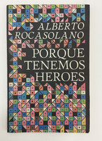
, "Todo lo que tiene fin es breve," 1983. Offset print, book., $25.00 (https://centerforcubanstudies.org/editorial-letras-cubanas-coleccion-giraldilla-cover-designer-raul-martinez-editor-juan-n-padron-author-luis-suardiaz-todo-lo-que-tiene-fin-es-breve-1983-offset-print-book/))
-
Raúl Martínez's cover design for Luis Suardíaz's poetry anthology "Todo lo que tiene fin es breve" showcases the artist's mastery of geometric abstraction and decorative patterning in Cuban book design. The cover features a vibrant mosaic composition of repeating petal or leaf-shaped forms arranged in a precise grid pattern against a stark black background. The palette of coral orange, emerald green, sky blue, and soft pink creates a chromatic rhythm that frames the clean sans-serif typography of the author's name and title. This geometric framework, reminiscent of traditional tile work or textile patterns, demonstrates Martínez's ability to adapt modernist design principles to Cuban cultural aesthetics. The design creates a visual tension between the organic curves of the individual motifs and the rigid geometry of their arrangement, perhaps reflecting the anthology's thematic exploration of time, brevity, and the flow of lived experience.
"Todo lo que tiene fin es breve" is a carefully curated anthology spanning twenty-five years of Suardíaz's poetic output, drawing from his previous collections including "Colección de poetas de la ciudad de Camagüey" (1958), "Haber vivido" (1966), "Como quien vuelve de un largo viaje" (1975), and "Leyenda de la justa belleza" (1978), along with twelve previously unpublished pieces. The collection represents a significant moment in post-revolutionary Cuban poetry, with Suardíaz (1936-2005)—a journalist, editor, and cultural figure who served as director of the Biblioteca Nacional José Martí and vice president of UNEAC—offering long-form verses that merge philosophical reflection with everyday experience. The poems challenge conventional temporality and explore the development of revolutionary consciousness through personal and collective history.
Martínez (1927-1995), one of Cuba's most influential graphic designers and pop artists, helped establish the visual identity of revolutionary Cuban culture through his work with the Cuban Film Institute, Casa de las Américas, and the Cuban Book Institute. His book covers for Editorial Letras Cubanas became iconic markers of Cuba's post-1959 literary production, combining international modernist sensibilities with distinctly Cuban visual vocabularies. This design for the Giraldilla series—named after the weathervane symbol atop Havana's Castillo de la Real Fuerza—exemplifies the sophisticated design standards of Cuban publishing in the 1980s. The decorative yet structured approach reflects both the aesthetic rigor of the revolution's cultural institutions and the accessibility these institutions sought to maintain. Printed at the Establecimiento "Mario Reguera Gómez" in October 1983, this volume represents the intersection of literary excellence and graphic innovation that characterized Cuba's most productive period of cultural production.
-
-
Discover More at the Center for Cuban Studies